Community Embraces New Word Game at Mid-Year Play Day This past Sunday, families at Takoma Park’s Seventh Annual Mid-Year Play Day had the opportunity to experience OtherWordly for the first time. Our educational language game drew curious children and parents to our table throughout the afternoon. Words in Space Several children gathered around our iPads […]
Read more Small differences have a big effect when trying to coax thousands or millions of people. This includes urging online readers to take an action. This post looks at how IDEA used small ads on one of our projects (a small, free web-based exhibit about Daylight Saving Time) to promote another project (a 99¢ app about Daylight Saving Time sold via the Apple app store). This post looks at statistics and ratios…
Text vs. graphical ads
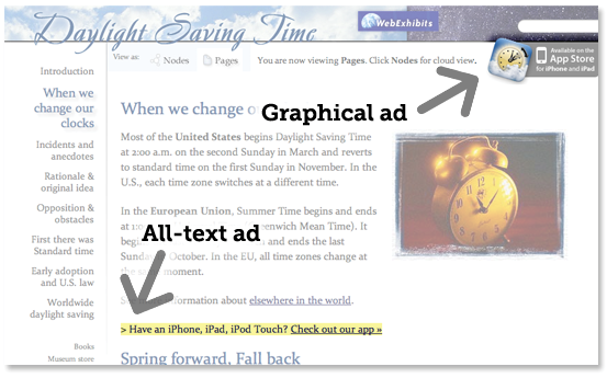
In this case study, text ads beat out the graphical ads by approx 6:1. That is, readers were much more likely to click the text ad. In the screenshot below, the graphical ad appears on the top and bottom of the page, displaying the app’s icon, and the wording “Available on the App Store for iPhone and iPad”. The all-text ad is embedded in the page’s content, and says “> Have an iPhone, iPad, iPod Touch? Check out our app »”

We did not try different graphical ads; it is possible that other graphical ads would have gotten more clicks.
Effect of wording on clicks
Small differences in wording dramatically affected whether readers clicked the text ad. We used the Google Website Optimizer to compare 25 different variations of the text ad. The optimizer automatically swapped text on the web page and counted how many visitors clicked. We did this in multiple batches, testing ad variations on approx 55 thousand visitors. Depending on the sample size for a given experiment, accuracy was 0.1 to 0.3%. Here are some illustrative results:
- 0.6% of test visitors clicked: “Have an iPhone, iPad, iPod Touch? Check out our app.” — This was our best ad.
- 0.2% of test visitors clicked: “Have an iPhone, iPad, iPod Touch? Check out our 99¢ app.” or “On the go? Get a cool 3D map, quick DST lookup for any country and more – only 99¢ at the App Store.”
- 0.1% of visitors clicked: “Check out the 99¢ interactive eBook of this exhibit at the App Store. Cool 3D map and quick lookup for any country.”
- No test visitors (testing on ~3000 visitors) clicked: “Get the DST exhibit eBook for iPhone, iPad, iPod Touch. Only 99¢ at the App Store.” or “Take this exhibit with you! Get the 99 cent eBook for iPod Touch, iPhone or iPad. All this info, a cool 3D map, and a quick lookup for change dates for any country.”
In other experiments, we found that little arrow at the end “»” helped. Also, including “iPod Touch” helped, as it was not obvious to some iPod Touch owners than apps for the iPhone would work for them.
Effect of color on clicks
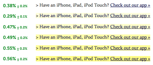
Yellow highlighting also enhanced clicking. Here are the results for different shades of highlighting:

Conclusions
For this situation, the lessons learned were: (a) text ads are better than graphical; (b) shorter text is better; (c) bright yellow highlighting helps; (d) Better not to include a price on the ads.
Many organizations have experience with online advertising such as text-ads in search engines. For example, Google’s AdWords has sophisticated tools for comparing different wording on ads. For in-house ads, consider using Google Optimizer to try different variations.
Note, this post is about click-through rates. In this experiment, we did not also measure the impact of the ad text on the likelihood a visitor would purchase from the Apple app store.
3 comments on Short, yellow and priceless: Effective ads to cross-promote
Comments are closed.


15 Mar 2011, 7:58 am
Another lesson that has to be added and might replace the graphic ad lesson, AND BASICALLY SHOULD RUIN THE TEST AND STATISTICS:
the graphic ad was cornered out, but the text ad was in the middle of both the page and the article
15 Mar 2011, 9:13 am
Thanks for your comment. The screen shot was cropped. The graphical ad was intended to be clear on the top of the page, but not intrusive. But it was not squeezed into a corner. We did not test other positions for the graphical ad.
19 Jul 2013, 6:23 pm
That is an amazing analysis. I would have anticipated that the graphical ad would have a better click through rate than a simple text based ad….interesting to know that it was opposite.