
Community Embraces New Word Game at Mid-Year Play Day This past Sunday, families at Takoma Park’s Seventh Annual Mid-Year Play Day had the opportunity to experience OtherWordly for the first time. Our educational language game drew curious children and parents to our table throughout the afternoon. Words in Space Several children gathered around our iPads […]
Read more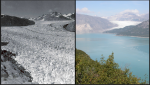 Images gain new meaning when given the context of location or change. Two sites, from NASA and HistoryPin do this to good effect — such as showing the the dramatic melting of the Muir glacier in Alaska, or how a city evolves.
Launched in autumn 2011 by a British nonprofit, HistoryPin pins historical items on a map. Their service demonstrates the potential for a global, crowdsourced database of historical media.
![]() HistoryPin now boasts 277,348 items. Their aim is to encourage a broad audience to take part in local and global history, help people feel closer to the places they live, to conserve and open up global archives, and to become a large global archive of human history. So far, they’re off to a good start. Many cities have several dozen pins, and a few large cities have hundreds.
HistoryPin now boasts 277,348 items. Their aim is to encourage a broad audience to take part in local and global history, help people feel closer to the places they live, to conserve and open up global archives, and to become a large global archive of human history. So far, they’re off to a good start. Many cities have several dozen pins, and a few large cities have hundreds.
The challenge of global coverage
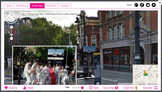
In the United Kingdom, HistoryPin’s home country, they have ~50k pins now. Some of those pins are cross-referenced with Google’s street view. For example, here are Elvis impersonators in Westminster, London, in 2006, superimposed on a current street view scene:
Despite the apparently high numbers, HistoryPin’s growth appears to be flatlining. They drew ~20k users in the few few months of 2011, helped by glowing press coverage at launch, but only at 30k more users in the last two years. They have 1,353 institutions registered, but few institutions are doing large-scale uploads. It’s unclear why growth is poor. The site is easy to use, and the usage terms are reasonable. They have a web site, as well as Android and iOS apps. One possible problem is that it’s unclear what the long-term future of HistoryPin is, so it’s not necessarily worth investing a lot of time. Also, they have a closed system, with no way to export content back out.
Growth needs to be exponential if HistoryPin has any hope of carpeting the globe. Relative to the U.K.’s 94k square miles of landmass, HistoryPin has barely 1 item for every two square miles. In London’s 607 square miles, HistoryPin has ~390 pins, again, barely 1 pin for every two square miles. HistoryPin would need at least 100x more pins to have serious global coverage. (For a sense of the scale needed for a global view, as of last year, Google Street View had photographed over 5 million miles of unique streets, covering 39 countries and about 3,000 cities, and they are rapidly expanding that.)
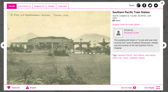
Nevertheless, the concept is compelling. Here’s an image from HistoryPin of a train station in Tuscon, Arizona, USA:
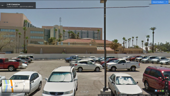
And here’s an image of the same building, 9 decades later, from Google Street View. It is now a restaurant:
Going global — from space
A global view is available from satellites. Here is a comparison of Tucson in summery 1984 (left) vs 2011 (right) from NASA’s State of Flux gallery, which posts weekly comparison images from satellites and land-based cameras.
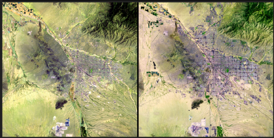
Tucson, in the Sonoran Desert in southern Arizona, is one of the oldest continually inhabited areas of North America, with evidence of settlements 3,000 years ago. As with many western cities, Tucson was organized on a grid pattern, which can be seen from space. The side-by-side photos show that the city has grown quickly over the past 30 years. Indeed, population in the greater Tucson area has increased from about 600,000 in 1980 to more than one million in 2011. Expansion has been largely in the eastern region since mountains on the north, west and south restrict development.
 The State of Flux site is run by Jet Propulsion Laboratory, and California Institute of Technology. It is a convenient launching pad for educators and the general public interested in change. The time periods range from centuries to days. Some are related to climate change, urbanization, or the ravage of natural hazards such as fires and floods.
2 comments on Changes over time, in photos and maps
Comments are closed.
09 Dec 2013, 10:36 am
[…] called History “pin” because the photos are pinned on a map. (See recent article about Changes over time, in photos and maps.) Some locations have photos from multiple dates, showing how a place has changed over time, or […]
12 Dec 2013, 12:00 pm
[…] It’s called History “pin” because the photos are pinned on a map. (See recent article about Changes over time, in photos and maps.) Some locations have photos from multiple dates, showing how a place has changed over time, or […]