
Community Embraces New Word Game at Mid-Year Play Day This past Sunday, families at Takoma Park’s Seventh Annual Mid-Year Play Day had the opportunity to experience OtherWordly for the first time. Our educational language game drew curious children and parents to our table throughout the afternoon. Words in Space Several children gathered around our iPads […]
Read more NASA redesigned their web site, with a magnificent failure of design by committee. It is a failure of content (eliminated the most interesting details about the science and engineering), a failure of organization (poorly consolidated types of content, such as multimedia and interactive features), and failure of implementation (site does not resize for small-screen smart phones, and failed to make popup menus work correctly on tablets).
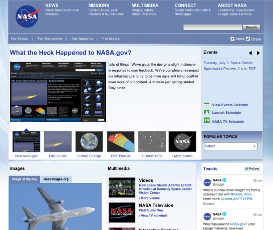
Here’s the new home page:
The link “For students” doesn’t go to a page with information for young minds who dream of space and exploration — rather, it links to a promo of a high-level NASA bureaucrat Leland Melvin receiving an award. Meanwhile, they eliminated the kinds of dreamy topics (space station, solar system, beyond earth) which were directly linked from the old home page.
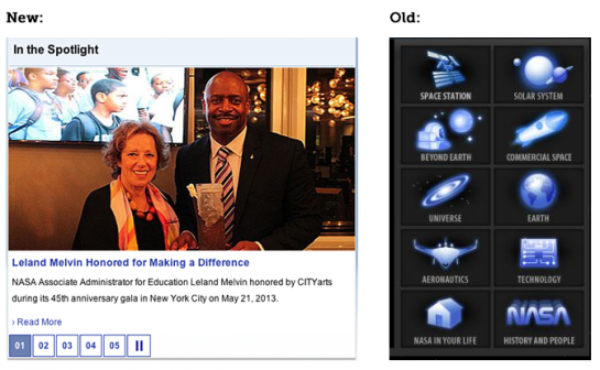
Leland looks interesting, and it’s good that NASA is featuring smart black professionals on their site, but this particular story about Leland is hardly going to excite a 13 year old kid on summer break who happens to surf the NASA site.
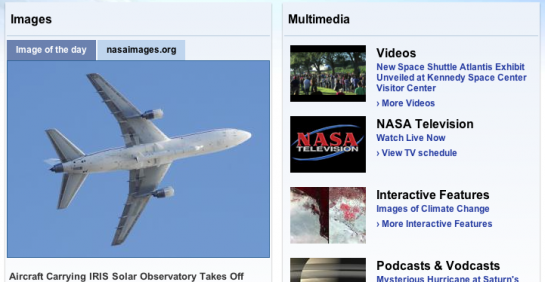
Another important failure is the false differentiation of types of content based on specifications of the department which produces them. At the same time that leading web sites like Facebook and Twitter, as well as major news outlets, are blurring the lines between text, photos, short and long videos, and audio content, NASA is taking a step backward under the delusion that the public thinks “images,” “multimedia,” and “sciencecasts” are different things, or cares:
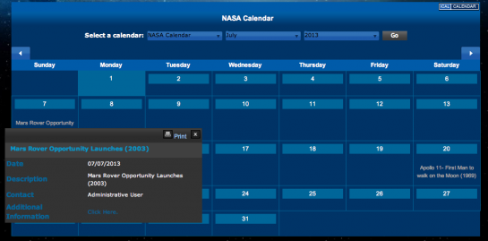
Meanwhile, lead screen real estate is given to “events”, which links to a calendar filled with empty months, and uninformative events metadata. These are not even real events, like Google+ hangouts with top scientists and former astronauts: They are merely anniversaries, such as the anniversary of the Mars Rover launch of 2003.
All in all, the new NASA site is a hugely missed opportunity to inspire and inform the public, as well as serve the multitude of stakeholders. It was obviously designed from a hugely introverted view of internal departments and procedures. It also may reflect the poor use of surveys to plan a site redesign. For example, survey respondents might say they want “images” and “multimedia” on the new site, but that does not mean the site should be designed using those particular navigational labels.
They make a nice attempt, but incomplete, to substantially integrate with various social media channels. The problem is that social media should be more pervasively integrated, and not put in silos which are linked away. Blogs are arbitrarily differentiated from news releases. Audio podcasts are arbitrarily differentiated from other multimedia. And mobile is still an afterthought in the underfunded, underdeveloped, NASA slideshow apps.
Some other federal goverment web sites are doing better. The White House, recently redesigned Weather (NOAA), and Census Bureau are among the best. Maybe NASA can do better too.
3 comments on NASA boldly redesigns web site for 2005
Comments are closed.
02 Jul 2013, 10:31 am
Obviously, they hired some technical contractor to get the job done instead of working with a real design team. Unfortunate waste of taxpayer dollars and total loss of focus on usability. For an agency that aims high and dreams big, it definitely dropped the ball on this one.
03 Jul 2013, 3:31 pm
Read their post on the redesign: http://www.nasa.gov/content/what-the-heck-happene…. So they had a very short amount of time, transitioned the entire back end environment, and have lots of improvements still planned. So maybe withhold the strong critique and condemnation until they have a chance to get the full redesign completed. It's not like they rolled it out and said, "Ta da! You're welcome America!"
04 Jul 2013, 5:34 pm
Thanks for your comments. I read the post, but I still think the site redesign is a step backward, and I hope they seriously rethink many aspects of the site as part of the overhaul they promise is coming next year.
While I commend NASA on the open-source content-management system, new content-delivery network and a new data center, upgrading infrastructure to be fast and reliable is a bare minimum requirement we can expect from a huge agency and is neither commendable nor is it news.